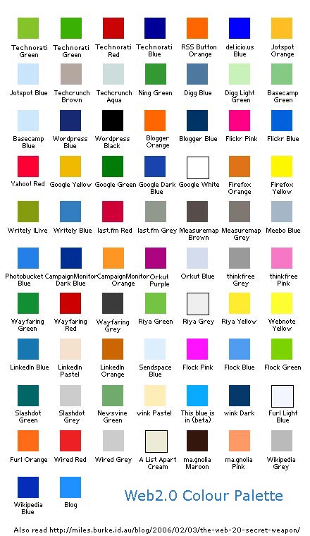
"...Web 2.0 到底有沒有什麼標準形象? 有沒有什麼 tips 讓 Web 2.0 看起來像 Web 2.0 呢?有的有的,整體來說,Web 2.0 要表現的不外乎幾個重點:親和、開放、互動、人性科技;從許多典型的 web 2.0 網站來看,不難分辨出幾個視覺重點,小寫字母取代嚴肅的大寫字母、顏色通常鮮明亮麗,許多的粉色調,開闊的天藍,活潑的橙色,還有,被戲稱為 Web 2.0 的國民色 lime green檸檬綠,這裡有位Ludwig Gatzke's compilation在他的格裡狂載了400餘個 web 2.0 站台的 logos, 相當有參考價值的 research,可以看出 2.0 的形象輪廓。
字體形象的部份,找到了幾個分類參考,大夥兒可以看看~....."
I also find this which is a logo listing of web 2.0 applications. You can click on the logo and find out what they are doing on the same page.
Another listing with tag bookmarking so that you can find useful web 2.0 tool directly.
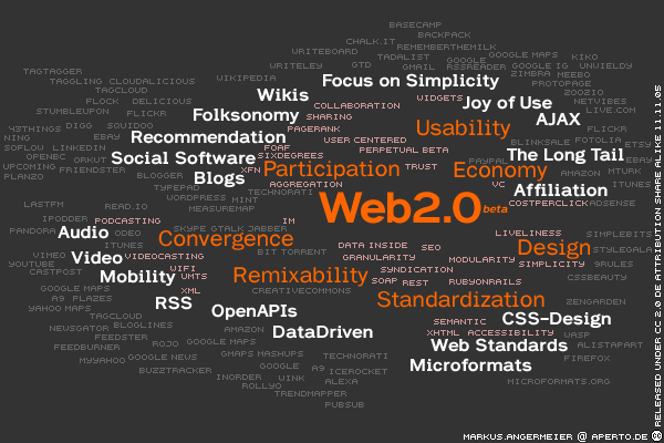
For mapping web 2.0 technology,a buzz cloud is build by Markus Angermeier. A multi language version is avaliable here.
A chinese version is translated by Lauren Lee an editor from Beijing major magazine.
An article (5 pages)that gives a more serious description and analyse of web 2.0.
沒有留言:
發佈留言